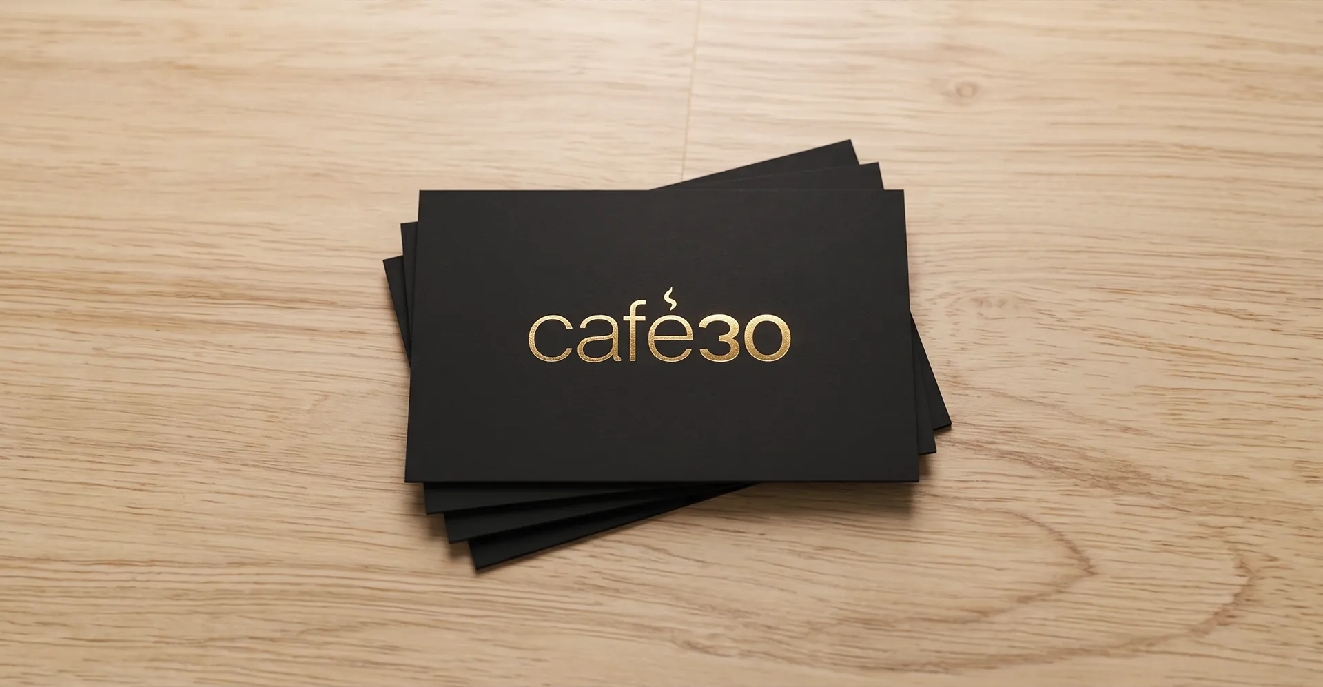
Project Overview
Role
Graphic Designer
Deliverable
Logo Design
Industry
Hospitality
The Challenge
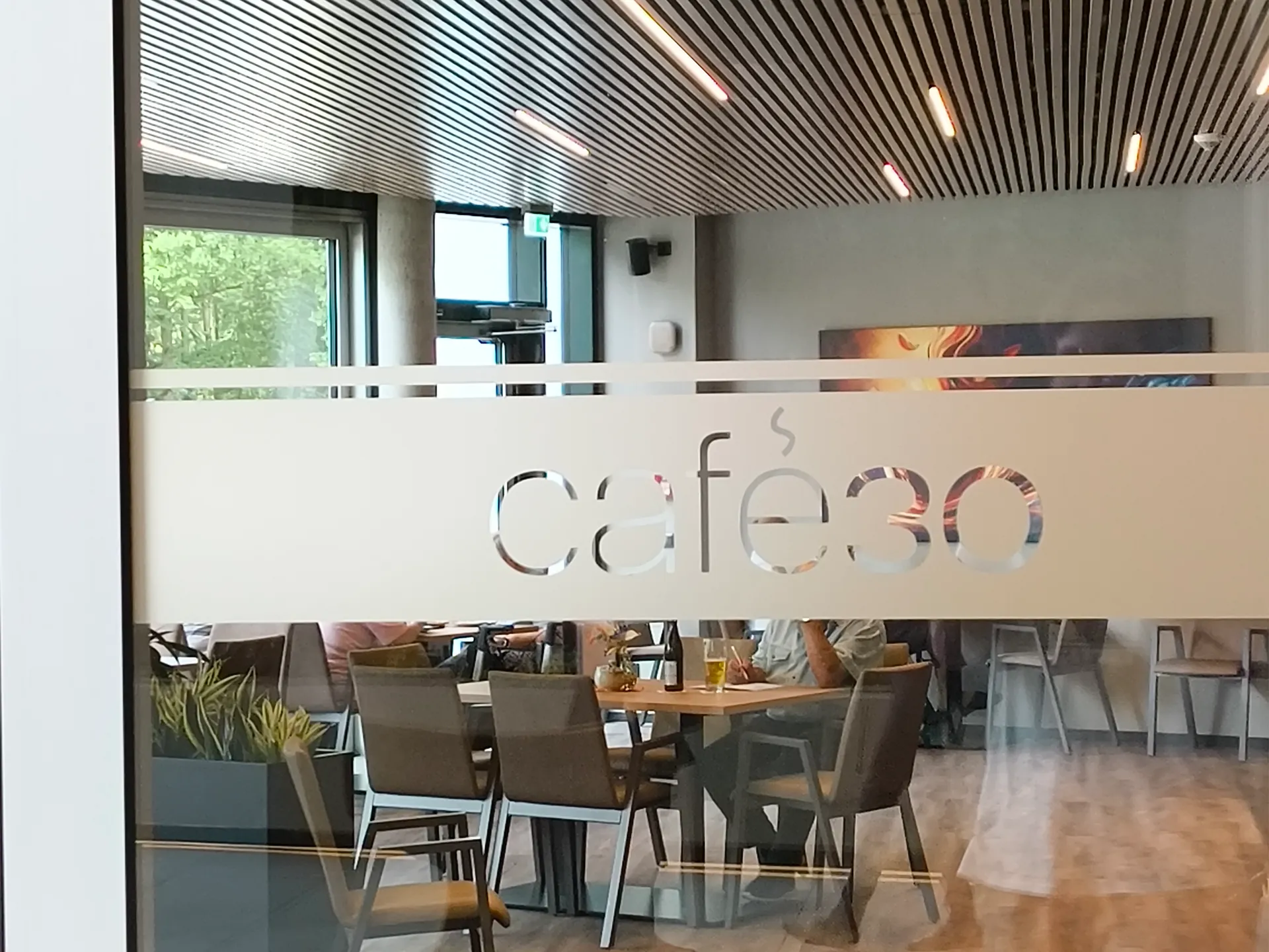
Café30 is a café located within a nursing home near the Nuremberg Zoo. Despite its location, the café was intended to be a welcoming destination for everyone, not just residents and visitors of the nursing home.
The goal was to create a modern, minimalistic identity that felt premium and approachable while avoiding visual clichés often associated with elderly care or traditional cafés.
My Approach
I explored several visual directions before presenting three concepts to the client.
The final concept focused on a clean typographic solution that communicates quality through simplicity.
Key design decisions included:
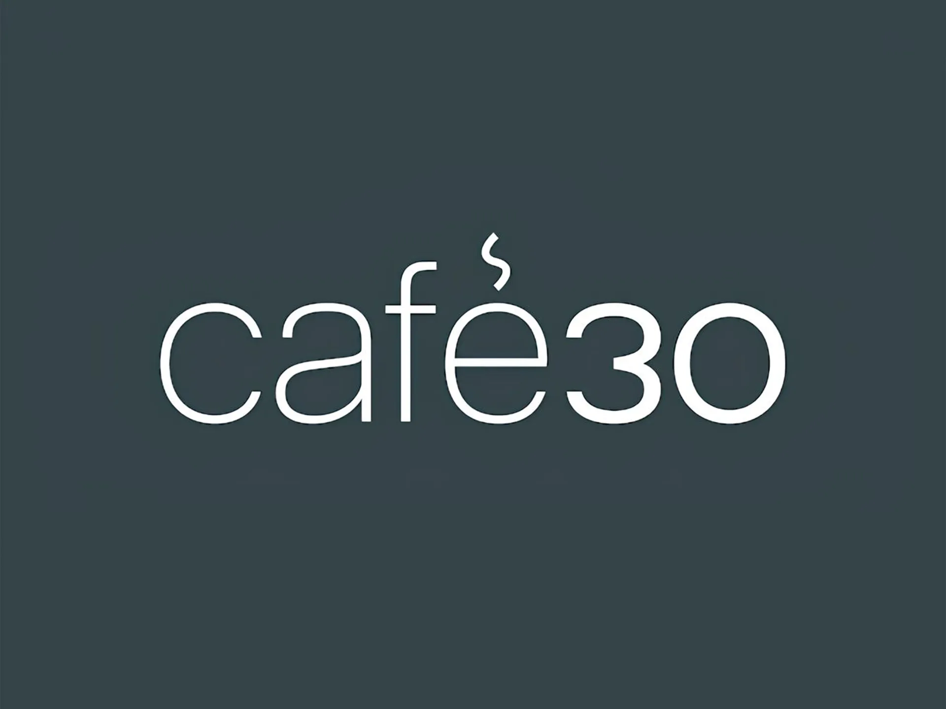
– Designing a custom „30“ that complements the chosen typeface and creates a unified wordmark.
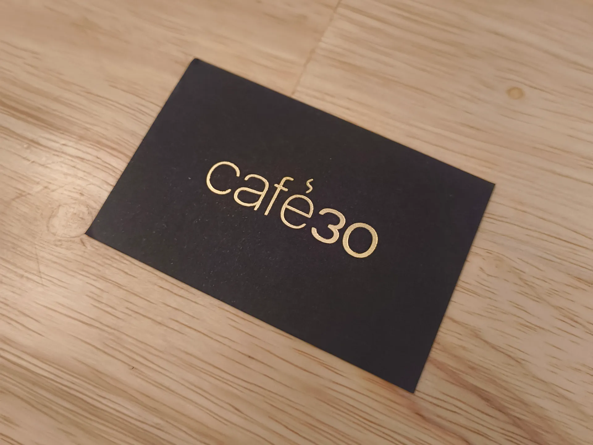
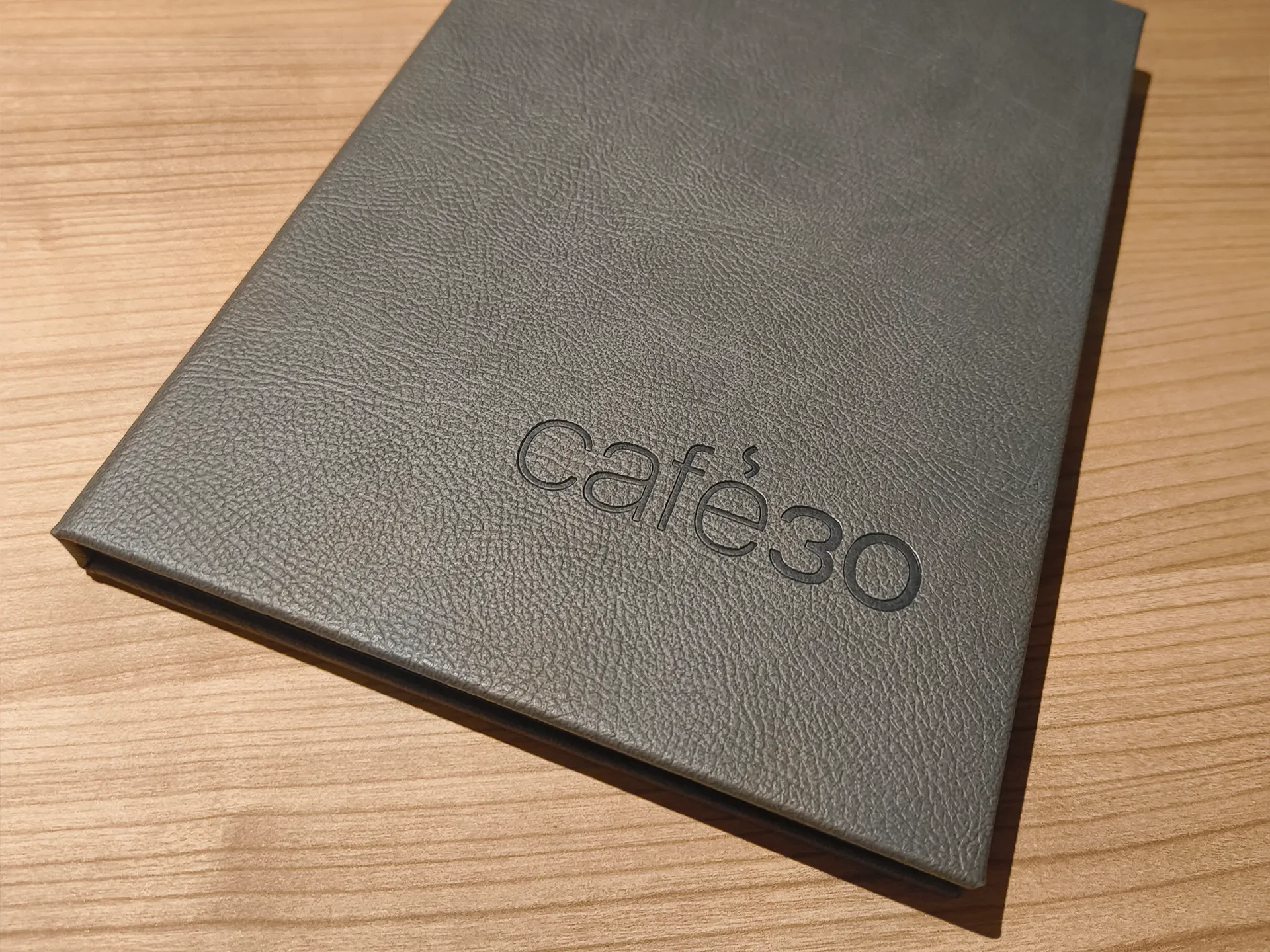
– Replacing the accent above the é with a subtle steam symbol, reinforcing the café theme without relying on obvious coffee cup icons.
– Using a restrained, minimal composition to create a contemporary and premium appearance.
– Keeping the identity approachable and timeless so it appeals to a broad audience rather than feeling tied to the nursing home.
Design Process
Three concepts were developed during the exploration phase, each interpreting the brand in a different way.
– Concept 1: A typographic logo inspired by a house number plaque, referencing the building number that gave the café its name.
– Concept 2: A more playful concept combining typography with a coffee cup icon incorporating the number „30.“
– Concept 3 (Selected): A custom typographic wordmark featuring an integrated steam symbol, providing the cleanest and most distinctive solution.
Outcome
The selected logo gives Café30 a modern and recognizable identity that stands on its own while remaining subtle, elegant, and welcoming. Its minimal design reflects the café’s premium atmosphere and supports the goal of attracting both nursing home visitors and the wider public.